Advanced Typography: Task 3 - Type Exploration & Application
23.05.22 - 27.06.22 (Week 9 - Week 14)
Chai Yi Xuan / 0346645 / B'
Creative Media
Advanced Typography
Task 3 / Type Exploration & Application
LECTURES
Week 1 - 4
Week 5 - 9
Previous lectures can be found in Task 2 - Key Artwork & Collateral
INSTRUCTIONS
To-Do List:
Develop a new font or explore an existing font that solves a larger problem or is a part of a solution in your area of interest.
Week 9
I thought up of a few topics that may be of interest to me, however, I narrowed it down to two possibilities I want to explore for this task. One of them is to develop a full set of alphabet from an existing font, and one is to further develop my font from Task 1 Exercise 2 (Part 1).
Figure 1.1: PDF presentation of proposal (26/05/22)
After a feedback session with Mr Vinod, I chose to develop a full set of alphabet from the game Slime Rancher's title.
Week 10
I took the game title and traced over the outlines of the letters. Then, I refined the structure of each letter through referencing with an existing text structure (ITC Garamond Std).
 |
| Figure 1.2: Tracing font structure/shape (31/05/22) |
 |
| Figure 1.3: Refining letterform (03/06/22) |
A lot of time was spent in refining each letter. I had to consider the consistency of the style, while making it legible and retaining its characteristics. This part of the assignment had tested the skills I developed in Task 1. Thankfully, I was (somewhat) successful in refining the characters and maintaining consistency for each letter.
Week 11
This was the most challenging part for me in this task. While Task 1 did trained me in refining existing characters, I now have the added challenge to create characters without a base to guide me. I kept in mind of the characteristics of the current letterforms and use it to create the others (I may or may not have copied parts of other letters to make my life easier).
 |
| Figure 1.4: Full set of letters, including numbers and some punctuation (11/06/22) |
It felt like a miracle that I managed to develop the set of letterforms without losing its characteristics. I then moved to FontForge to develop my font.
Week 12
This step was daunting. Just when I thought that creating the letterform was the last of suffering I needed to go through, I realised that I had to kern each pair of letters. From letter to letter, letter to number, letter to punctuation, etc. It was then that I noticed my progress is actually slower than I thought.
 |
| Figure 1.5: Kerning in FontForge (12/06/22) |
 |
| Figure 1.6: The horrifying amount of pair kerning (17/06/22) |
After that rollercoaster of pain and suffering, I finally finished making my font presentable, and generated it to a usable font.
Week 13
In the process of kerning, I tried applying my font into things I want to use them for. I was planning on applying my font into the game's merchandise, On the top of my head, I thought of a poster. So I took the game's loading screen and tried to apply the font into it as a test drive.
 |
| Figure 1.7: Testing my font application (19/06/22) |
A little disappointing— but I figured it's the visuals that were too distracting, thus the attention on my font was taken away, which was the opposite of what I want. Hence, I felt that my font would work better on a plain surface, or at least one with lesser visuals.
The few objects I selected as the game merchandise would a mug, shirt and tote bag. I looked up of some mock up photos of various items.
 |
| Figure 1.8: Improved promotional poster collateral (21/06/22) |
 |
| Figure 1.9: Mug design #1 (21/06/22) |
 |
| Figure 1.10: Mug design #2 (21/06/22) |
 |
| Figure 1.11: Shirt design (22/06/22) |
 |
| Figure 1.12: Tote bag design (22/06/22) |
Submissions: Developed Font and Application
 |
| Figure 1.13: Developed font Slimy, overview (24/06/22) |
 |
| Figure 1.11: Font display, dark (24/06/22) |
 |
| Figure 1.12: Font display, light (24/06/22) |
 |
| Figure 1.13: Main application, promotional poster (24/06/22) |
 |
| Figure 1.14: Merch application, shirt (24/06/22) |
 |
| Figure 1.14: Merch application, tote bag (24/06/22) |
 |
| Figure 1.14: Merch application, mug #1 (24/06/22) |
 |
| Figure 1.14: Merch application, mug #2 (24/06/22) |
PDF file for Task 3 Type Exploration & Application
Figure 1.15: PDF of typeface and its application (24/06/22)
Download the typeface here: Slimy
FEEDBACK
Week 10
Week 12
Week 13
REFLECTIONS
When we started this task, I was a little lost on what to do. I wasn't sure of what I could choose as a potential topic as type exploration. After referencing with some of my seniors' works, I had the gist of what I can do for the assignment.
While developing the typeface, I find it easy to refine existing characters, thanks to a previous task I have done. However, the challenge presented this time around was that I had developed more letterforms outside of an existing base. A lot times I had to take a break because I worked on some characters for too long that it felt like it wasn't good enough. Surprisingly, the pair kerning in FontForge took longer than designing the letterform, which took up a chunk of my time. The collateral were easier to handle, as I have already done something similar in Task 2.
Overall, this task was the most time consuming assignment I had for the semester (or at least, it felt like it). I like the assignment for its flexibility for us to be creative and choose our theme, but it was certainly a handful and I felt overwhelmed by this task. If I had the chance to do this again, I'll probably have to look up on a more efficient method of generating font, because FontForge can be very time consuming. I would probably make more collateral than I have currently, though time is something I have very little of and this would be the best that I can do.
FURTHER READINGS
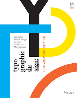 |
| Figure 1: Typographic Design: Form and Communication |
Reference:
Carter, R., Day, B., Meggs, P. B., Maxa, S., & Sanders, M. (2015). Typographic design: Form and communication. Hoboken, New Jersey: John Wiley & Sons, Inc.
The Anatomy of Typography
Page 31 - 47
 |
| Figure 2.1: Extending letterforms beyond cap height and baseline |
 |
| Figure 2.2: Different widths of horizontal and vertical strokes |
Values and tones of the font and background can influence the legibility of text. Sharper contrast is preferred as it improves readability. In colour, schemes like complementary colours can decrease legibility due to two different colours fighting for attention. It is advisable that the value of text and background also contrasts each other (e.g.: dark blue text, light orange background)
Programs like Adobe provided a chance for flexibility, allowing designers to resize text vertically/horizontally. This leads to the distortion of texts, which serves more of the purpose of expressing visual ideas rather than for reading. This should only be done after considering objectives, requirements, and limitations of the typographic problem at hand.


Comments
Post a Comment