Typography Task 3B: Type Design & Communication

Chai Yi Xuan / 0346645 / B' Creative Media
Typography
Task 3(B) / Type Design & Communication
LECTURES
Week 1-4
Previous lectures can be found in Typography Task 1: Exercise 1 & 2
Week 5-6
INSTRUCTIONS
Task 3B: Type Design & Communication
To-Do List:
Design a greeting sticker using the 10 typeface provided, (1) black & white and (1) coloured
Week 11
I selected the theme Chinese New Year from the list of greetings Mr Vinod provided. After selecting my greeting, I searched up on some elements and stickers that correlates to my theme.
 |
| Figure 1.1: Chinese New Year 2021 stickers for WhatsApp, iMessage and Telegram (Link) |
 |
| Figure 1.2: CNY stickers, mainly graphical elements |
 |
| Figure 1.3: CNY stickers for LINE (Link) |
Not that much of a typographical sticker collection, but the elements used can be helpful in the designing stage. I proceeded towards sketching out some sticker ideas (of course, with more focus on the typography part).
 |
| Figure 1.4: Sketch for CNY sticker (03/11/21) |
Feedback was given for the sketch, and I chose one of them and refined it to look cleaner and less graphical.
 |
| Figure 1.5: Improved sketch from initial draft (06/11/21) |
Week 12
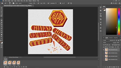
I started digitizing the sketch in Adobe Illustrator. I experimented with the position of the elements and words until I ended up with Sticker Prototype #1. I realised that it would be hard to read the text of the sticker around the firecrackers, so I made more adjustments to it to increase visibility(legibility).
 |
| Figure 1.6: Initial digitized sticker (08/11/21) |
 |
| Figure 1.7: Digitized sticker— prototype (09/11/21) |
After receiving feedback once again for my sticker, I made more adjustments to it to accommodate the changes needed.
 |
| Figure 1.8: Digitized sticker, revamped (13/11/21) |
Once I was satisfied with what I done, I head on to animate the sticker.
Week 13
I was not masterful in Adobe After Effects, so it was grueling process to figure out what I can do to create an animation. Luckily, Mr Vinod offered an alternative and allowed us to create the GIF animation through Photoshop instead. Unfortunately, this means there wouldn't be any animated sticker in Telegram— but at least we can see how the sticker could potentially look like animated.
 |
| Figure 1.9: Animating sticker GIF in Photoshop |
Final Type Design & Communication (B)
 |
| Figure 1.: Finalised CNY sticker, black & white |
 |
| Figure 1.: Finalised CNY sticker, coloured |
PDF file for Exercise 3(A): Type Design & Communication
 |
| Figure 1.: Finalised sticker GIF animation |
 |
| Figure 1.: Sent stickers in Telegram (light background) |
 |
| Figure 1.: Sent stickers in Telegram (dark background) |
Link to Telegram sticker pack: https://t.me/addstickers/CNYGreet
Sticker created using Sticker Bot on Telegram.
FEEDBACK
Week 11
The square space (512px * 512px) should be used to the maximum, to ensure that the words are readable. If possible, graphical elements should be substituted with words/typographical elements (try ratio of graphic to words 3:17). The ideas/concept are good. Select one of them and improve it according to the general feedback given.
Week 12
A reminder that the sticker should have limited graphical elements, lest the sticker becomes reliant on it. For the sticker animation, remember to loop it and export it at 1024px, still stickers at 2048px. Experiment with the font of the words in the firecracker, and try to match it with the word 'happy'. The Taylor's logo is barely visible when sent in chat, so find somewhere else to place the logo.
REFLECTIONS
Experience
The researching part of this assignment was less tedious compared to the last one, since there's not much but inspirations needed. The designing process was more of a challenge— I had to accommodate it to mainly typographical rather than graphical. More often than not, I end up relying too much on the graphical elements. Animating the sticker came easier to me, in Photoshop at least, so that part was arguably the easiest part of the assignment (wouldn't be saying the same for it if it had been After Effects tho).
Observations
I have observed that there are fonts that matches certain themes, while others might not be up to par. While this can be entirely influenced by bias/individual's observation, the main focus should be that the typeface is able to express what is needed to be expressed. In this case, my choice of typeface for the sticker was what I feel would be suitable for the situation, so I implemented it. Of course, I still had to use the font to the best of my abilities to express my greeting sticker.
Findings
I found that colours can influence how people feel about your sticker, and how much do they recognise it at first glance. For example, my sticker is a Chinese New Year greeting, which is mainly red and gold in colour. Therefore, when I was creating my coloured sticker, I could instantly know that my sticker is for CNY at first glance. Of course, since this is a Typography module, I had to start from black & white, which helped me focus more on developing the type expression rather the aesthetic look of it.
FURTHER READINGS
 |
| Figure 1: Typographic Design: Form and Communication |
Reference:
Legibility
Page 49 - 64
 |
| Figure 2.1: Values and tones of font and background |
 |
| Figure 2.2: Colour contrast of font and background |
Values and tones of the font and background can influence the legibility of text. Sharper contrast is preferred as it improves readability. In colour, schemes like complementary colours can decrease legibility due to two different colours fighting for attention. It is advisable that the value of text and background also contrasts each other (e.g.: dark blue text, light orange background)
 |
| Figure 2.3: Different tones of violet against a blue background |
 |
| Figure 2.4: Different typefaces against colours effecting legibility |
 |
| Figure 2.5: Font size against colours effecting legibility |
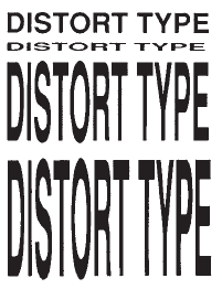 |
| Figure 2.3: Distorted text |
Programs like Adobe provided a chance for flexibility, allowing designers to resize text vertically/horizontally. This leads to the distortion of texts, which serves more of the purpose of expressing visual ideas rather than for reading. This should only be done after considering objectives, requirements, and limitations of the typographic problem at hand.


Comments
Post a Comment