Typography Task 1: Exercises 1 & 2

Chai Yi Xuan / 0346645 / B' Creative Media
Typography
Task 1 / Exercises 1 & 2
LECTURES
Week 1 (Development of Typography)
Phoenician to Roman
 |
| Figure 1.1: Evolution from the Phoenician letter |
Letter types/Fonts can be influenced by the type of tools used. As shown in the table above, Arabic and Modern Latin were derived from the Phoenician letters.
 |
| Figure 1.2: Direction of writing |
The direction of writing is changed by the Greeks. "Boutrophedon" (how the ox ploughs) is style that requires the reader to read from left to right then right to left, and so on. It changes the way the letter is written.
 |
| Figure 1.3: Augustan inscription in the Roman Forum |
Painters/Typographers painted over marbles before words are chiseled, and the strokes developed from the brushes resulted in its distinct characteristic of the letterforms.
 |
| Figure 1.4: The development of letterforms from Phoenician to Roman |
 |
| Figure 1.5: Square Capitals |
 |
| Figure 1.6: Compressed version of square capitals |
Square Capitals have serifs at the end of the main strokes, which was
created from tilting the pen at a 60 degree angle off the perpendicular, Meanwhile, the compressed version of square capitals took up less space in a parchment, and it took lesser time to write. However, due to its nature, the text can be hard to read. These letterforms are usually used in documents because of its legibility.
 |
| Figure 1.7: Roman cursive writing |
On the other hand, cursive writing is used in day-to-day life settings. The letters were simplified for speed— and these simplifications are the development of lowercase letterform.
 |
| Figure 1.8: Unicals |
 |
| Figure 1.9: Half-unicals |
 |
| Figure 1.10: Caloline miniscule |
Unicals are letterforms that integrated elements of capital and lowercase letters. (Uncia [Latin]: a twelfth of something) Some scholars think that are one inch in height, but it might be more accurate to say that uncials are just small letters. Half-unicals are furthered formalized, an indication of the formal beginning of lowercase letterforms.
Charlemagne issued an edict to standardize in clerical texts, which led to monks writing in uppercase, miniscule, capitalization and punctuation. It set the standards for calligraphy for a century.
 |
| Figure 1.11: Blackletter |
 |
| Figure 1.12: Gutenberg's type |
After the dissolution of the Charlemagne empire, there were various changes upon the Alcuin's script. Blackletter (or textura) was a letterform that was condensed and strongly vertical. It is used in north Europe. Gutenberg (excels in engineering, metalsmithing, and chemistry) marshaled the Blackletter which accurately mimicked the work of the scribe's hand. His type mold required a different brass matrix (negative impression) for each letterform.


Figure 1.13 & 1.14: Typography development timeline
Text Type Classification
- 1550 Script: Keunstler Script, Mistral, Snell Roundhand
- 1750 Transitional: Baskerville, Bulmer, Century, Time Roman
- 1775 Modern: Bell, Bodoni, Caledonia, Didot, Walbaum
- 1825 Square Serif/Slab Serif: Clarendon, Memphis, Rockwell, Serifa
- 1900 Sans Serif: Gill Sans, Franklin Gothic, Futura, Helvetica, Syntax, Univers
- 1990 Serif/Sans Serif: Rotis, Scala, Stone
Week 2 (Describing Letterforms)
 |
| Figure 2.1: Composition of letterforms |
 |
| Figure 2.2: Letterform strokes |
 |
| Figure 2.3: Apex of letterforms |
 |
| Figure 2.4: Letterform arms |
 |
| Figure 2.5: Ascender |
 |
| Figure 2.6: Barb |
 |
| Figure 2.7: Letterform with bowls |
 |
| Figure 2.8: Bracket in letterforms |
 |
| Figure 2.9: Cross bars |
 |
| Figure 2.10: Cross strokes |
 |
| Figure 2.11: Crotch in letterforms |
 |
| Figure 2.12: Descenders |
 |
| Figure 2.13: Letterform ears |
 |
| Figure 2.14: Em/en |
 |
| Figure 2.15: Finial |
 |
| Figure 2.16: Ligature |
 |
| Figure 2.17: Letterform links |
Week 3 (Text/Tracking: Kerning and Letterspacing)
 |
| Figure 3.1: Differences of kerning and without kerning |
Kerning refers to the adjustment of space between the letters (often mistaken for letterspacing). Tracking is the addition and removal of space in between a word/sentence.
 |
| Figure 3.2: Various tracking |
 |
| Figure 3.3: Letterspacing |
Letterspacing is not encouraged when it comes to lowercases. This is because lowercases require counterform(highlighted in black at the diagram above) to achieve readability.
 |
| Figure 3.4: Left alignment |
 |
| Figure 3.5: Center alignment |
 |
| Figure 3.6: Right alignment |
 |
| Figure 3.7: Justified alignment |
 |
| Figure 3.8: Example of how type affects readability |
When it comes to type, typographers' first priority is to be clear, and appropriately present the author's message. If the type is the first thing the viewers see, it needs to be changed.
 |
| Figure 3.9: Dissection of a type structure |
There are factors to be considered when it comes to text types, like type size (large enough to read easily at arms length), leading (spacing between letters must not be too tight/narrow), and line length (between 55-65 characters).
 |
| Figure 3.10: Type Specimen Sheet |
Week 4 (Text/Indicating Paragraphs)
The pilcrow (¶) is one of the indications for paragraphs, which is a holdover from medieval manuscripts. Paragraph spaces are adjusted according to line spaces to ensure cross alignment.
 |
| Figure 4.1: Line space vs leading |
 |
| Figure 4.2: Standard indentation |
 |
| Figure 4.3: Identifying widows and orphans |
 |
| Figure 4.4: Adding contrast for emphasis of information (1/2) |
 |
| Figure 4.5: Adding contrast for emphasis of information (2/2) |
 |
| Figure 4.6: Arranging highlight text to maintain reading axis (right) |
 |
| Figure 4.7: Placing typographic elements outside of alignment |
 |
| Figure 4.8: Quotation creating indents |
Indented quotes can break the reading axis. It is advised that these quotations be extended outwards to maintain the reading axis.
 |
| Figure 4.9: A heads |
 |
| Figure 4.10: B heads |
 |
| Figure 4.11: C heads |
A heads are used to break between topics of a section. They generally stand out amongst all the texts on print/screen. On the other hand, B heads are used in creating new supporting ideas/arguments and examples of the topic. C heads are used the least— they function as a highlight for certain materials in the B heads.
Putting together the heads will create visual and information hierarchy.
 |
| Figure 4.12: Cross alignments |
Cross alignments are important, as they give a sense of structure in terms of texts.
INSTRUCTIONS
Exercise 1: Type Expression
To-Do List:
Choose four words out of the seven in the poll, and create a type expression reflecting the meaning of the word— using the typeface given.
Week 1
Mr Vinod briefed us in detail about our first task— a typography
exercise. We suggested various words with different meanings, which Mr
Vinod compiled into a poll. We each chose a word, and the top 7 words in
the poll would be our choices for Typography Task 1.
Once the poll was done and the words finalised, it was time to create some sketches from the words. I chose the words Terror(mandatory), Colossal, Space, and Broken(word of choice).
 |
| Figure 1.1: Sketches of type expression for the four words (30/08/21) |
Week 2
Feedback was given by Mr Vinod and Mr Charles. Mr Vinod also put us into breakout rooms in Zoom and have our peers evaluate and provide suggestions to our work.
After receiving some feedback, I adjusted drafts accordingly. I added two more sketches to Space and Broken to further explore the ideas.
 |
| Figure 1.2: Sketches of type expression, updated after feedback (03/09/21) |
Once the sketches are done, it was time to digitize them.
 |
| Figure 1.3: Digitized version of type expression (05/09/21) |
Week 3
Mr Vinod created a Facebook posts, where we all shared our progress and received feedback for our work. After hearing the lecturers and students response, I revamped the design and improve my previous digitization.
Final Type Expression (Digitized)
 |
| Figure 1.4: Final outcome of digitized type expression (06/09/21) |
PDF file for Exercise 1: Type Expression
Week 4
After digitizing our type expression, we were to choose one of them and animate it. I decided to go with the word Broken as I have the idea and it has more movement compared to other fonts.

Finally, the GIF animation was done. Feedback was given in class(Friday, 17/09/21).
Final Animated Type Expression
 |
| Figure 1.7: Final outcome of GIF |
Exercise 2: Text Formatting
To-Do List:
Format an incremental amounts of text given and familiraise with information hierarchy and spatial arrangement.
Week 4
We were given a set of videos as a guide for our second exercise: text formatting. There were four videos in total for us to look through— each vital for Exercise 2.
Warmup exercise
Kerning is the spacing between individual characters. This exercise is to train ourselves to adjust the spacing between letters to create a visually pleasing text of words.
 |
| Figure 2.1: Kerning and tracking exercise; before kerning (18/09/21) |
 | |
| Figure: 2.2: Kerning and tracking exercise; after kerning (18/09/21) |
 |
| Figure 2.3: Kerning and tracking exercise; comparison of before(faded) and after(solid) (18/09/21) |
After a mini warmup, it was time to tackle actual formatting of texts. In the videos, there were some important points to note when we format a paragraph of texts:
- A good margin space; equal margin space appears monotonous, create margins that are less conventional
- Font size between 8-12 pt, vary depending on the number of characters per line
- Line length should have about 55-65 characters
- Leading space should be about +2 to +3 pt to the line length; can vary depending on font type
- Text width should be the same if information is related.
- Kerning should be only +3/-3; anymore will make the text look to broad/narrow
- Stick to left alignment/left justify with large body of texts
- Cross alignments
- Avoid widows and orphans
 |
| Figure 2.4: Maintaining cross alignment in body text (19/09/21) |
There were a few spacing errors in between some words, checked through showing hidden characters. I fixed the errors in them.
 |
| Figure 2.5: Spacing errors (19/09/21) |
 |
| Figure 2.6: Spacing errors, fixed (19/09/21) |
After making sure that everything is in place, I arranged a few layouts to gauge on what looks more appealing.
 |
| Figure 2.7: Layout attempt #1 (19/09/21) |
 |
| Figure 2.8: Layout attempt #2 (19/09/21) |
 |
| Figure 2.9: Layout attempt #3 (19/09/21) |
In the end, I decided to go for Layout Attempt #3, as the positioning of body text create dynamic. The white spaces in between creates breathing room for the viewers, and therefore looks more appealing and "readable" to the audiences.
Final Text Formatting
Font Choice: ITC Garamond Std (Bold, Bold Italic, Book, Light Italic)
Point Size: Body text (9 pt), Heading (19 pt), Sub-heading (9 pt), Caption (9 pt)
Leading: Body text (11 pt), Heading (22 pt)
Paragraph Spacing: 12 pt
Line Length: Average 60 characters
Alignment: Left justify
 |
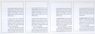
| Figure 2.10: Final Outcome for text formatting (19/09/21) fixed (24/09/21) |
PDF file for Exercise 2: Text Formatting
FEEDBACK
Week 2
Mr Vinod was satisfied with the word Colossal. The first sketch of the word Terror can be improved by playing around with the width of the font, and the third sketch needs to be more exaggerated to express its meaning. The word Space can be improved by adding smaller letters to emphasize the idea. Broken can have more exploration.
In the breakout rooms, my peers gave some valuable feedback for the sketches, allowing me to improve my work.


Figure 1: Feedback from my peers in Zoom breakout rooms (03/09/21)
Week 3
Each typeface has expressed the meaning of the words, but can be further improved. The word Terror has the proper idea, but needs better execution. Space can be improved by making the background letters more variant(differ in sizes), plus little bit of rotation to bring out the feeling of being in space. Colossal is good, but a classmate suggested that the word can be bolded to further emphasize the word. Broken is the only type expression that is satisfactory.
Week 4
The animation is good. The overall GIF expresses the meaning of the word Broken. There is an understanding of the bouncing mechanism, which makes the animation more lively. Mr Charles noted that the word has a nice clean cut despite the crumbles in the animation.
Week 5
[[Feedback for overall Task 1, graded by Mr Vinod]]
Final submission for Exercise 1 should be labelled as Final. There is good show of progression in Exercise 2. However, hyphenation is still visible and cross alignment has yet to be achieved.
REFLECTIONS
Experience
When we started Exercise 1, I was racking my brain for an idea for the type expressions. With the limited amount of words and many peers, I want to create a design that would be different to avoid a clash of ideas. There was also an added challenge of having to express the word through the 10 fonts given and refraining from using illustrations. In the end, it was a hurdle I had to overcome.
In the digitization stage, I had to familiarize myself with Adobe Illustrator. Much of the problem comes from not knowing the shortcuts and hotkeys, which lengthened my process in digitizing. However, after the exercise, I became more efficient in it. This also helped when it was time to animate the typeface, as I can switch between the tools much faster.
For Exercise 2, I had to learn about Adobe InDesign, which has a different layout than Illustrator. Once again, I had to learn more about the tools and its functions to accomplish my exercise. Overall, Task 1 is a good assignment for us to get used to various Adobe programs which are essential for the rest of our semester.
Observations
I observed that each font has its distinct trait that sets apart from each other. The differences also gives off a different impression to the viewers, which is why selecting the 'right' type of font is important.
I noticed that there is more than just fonts when it comes to Typography. There also other factors like information hierarchy and spatial arrangement to consider. Typography is not all about just type choice, but also the arrangement of words that makes text readable and appealing to viewers.
Findings
I found that Typography has a set of 'rules', which makes the layout/composition of a text look appealing. These rules are essential to create legible works, and also capture and maintain the audience's attention.
I should improve my understanding on font choices, as they affect how the viewer sees a certain document and can either maintain their attention or lose it.
FURTHER READINGS
 |
| Figure 1: Typography Referenced: A Comprehensive Visual Guide to the Language, History, and Practice of Typography (29/05/20) |
Reference:
Haley, A. (2020). Typography Referenced: A Comprehensive Visual Guide to the Language, History, and Practice of Typography. eBook Collection (EBSCOhost) - printed on 5/29/2020 4:27 AM via TAYLORS UNIVERSITY
Type Design & Development (by Gerry Leonidas)
Page 31 - 51
As the years progress, the number of typefaces keeps growing to accommodate various needs in the market. The type market isn't forgiving, as technology progress different fonts are needed to fulfill the requirements of legible texts, yet standing out enough to have an identity itself.
 | |
| Figure 1: One of the sketches in development of the font Antonio Cavedoni’s Enquire |


Comments
Post a Comment