Typography Task 3A: Type Design & Communication
Chai Yi Xuan / 0346645 / B' Creative Media
Typography
Task 3(A) / Type Design & Communication
LECTURES
Week 1-4
Previous lectures can be found in Typography Task 1: Exercise 1 & 2
Week 5-6
Previous lectures can be found in Typography Task 2: Typographic Exploration & Communication
Week 8
Task 3A Demonstration:
INSTRUCTIONS
Task 3A: Type Design & Communication
To-Do List:
Design a limited amount of Western characters and create a poster to showcase it
Week 8
As the demonstration video suggested, I looked up on some types that I find appealing and observe their unique characteristics.
I sketched out some font ideas based on some of the fonts I've come across.
 |
| Figure 1.4: Font sketches |
I much prefer the last font(bottom right), so I decided to format it for my type.
Before actually formatting it in Adobe Illustrator, I had to pick a similar font and dissect it— in order to understand its structure and reflect it on my type. I picked ITC Baskerville as it is the closest font that has the serif that I wanted.
 |
| Figure 1.5: Screenshot of dissecting the ITC Baskerville font |
Notes: The O is not perfectly rounded, and it's bowl has a tiny bit of differences. The serifs are about the same width as the strokes. The brackets in letterform have dissimilarities. Spaces between serifs are about two-strokes width.
Week 9
Once I was done analyzing, I proceeded to illustrate my font.
 |
| Figure 1.6: Setting guidelines |
 |
| Figure 1.7: Creating the letter E |
 |
| Figure 1.8: All letter constructed |
Week 10
With all the character needed are constructed, I moved onto FontLab. I transported my illustrated characters to FontLab5.
 |
| Figure 1.9: Importing characters into FontLab5 |
 |
| Figure 1.10: Kerning the characters [1/2] |
 |
| Figure 1.11: Kerning the character [2/2] |
When I was done formatting my font, I generated it and installed. I was about to move onto the final stage, however—
 |
| Figure 1.12: Error in generated font |
I certainly do not know what went wrong, but! This isn't my initial font, and therefore have to be redone. Instead, I moved towards FontLab7, in hopes that it was just the matter of faulty program.
 |
| Figure 1.13: Working in FontLab7 |
It worked (thank the gods and everything else), and I am now ready to move on to the stage of presenting my type. I created multiple posters to represent my font.
 |
| Figure 1.14: Poster draft #1 |
 |
| Figure 1.15: Poster draft #2 |
I ended up going with poster draft #2 after much deliberation. I felt that the poster allows me to show off the font I made clearly.
 |
| Figure 1.16: Typeface "Vertica Regular" |
 |
| Figure 1.17: Finalised typeface poster |
PDF file for Exercise 3(A): Type Design & Communication
Download the typeface here: Vertica Regular
FEEDBACK
Week 8
Before starting and mapping out the type, guidelines (ascender, descender, x-height, baseline, etc.) must be set. This is to ensure that the type can be done at a proper proportion during the designing process, to prevent awkward or bad structure of letters.
Week 9
The strokes in the font should be consistent. If vertical strokes are to be bolded, ensure that all vertical strokes are bolded to maintain a balanced look. The idea of breaking typographical rules is nice, but avoid doing so at this stage as the assignment's goal is to create readable fonts. Other than that, the letters are consistent in width.
Week 10
The font looks relatively consistent and feels quite open.
REFLECTIONS
Experience
The start of the
assignment was a dull process, researching was not my interest nor my
forte. However, I did find some types to be pleasing to look at and
readable. I did my best in observing their special characteristics and
take them as inspirations for my font. The designing process was fun,
but it was challenging as well due to it being my first
time(officially).
FontLab was another new territory for me,
but the videos Mr Vinod has provided had helped with some of the basics,
and made the process better rather than pretending that I know what I
was doing.
Observations
I observed that each fonts, though look similarly to others, does have their own unique characteristics. These characteristics are created from changing of strokes, counter, bowls, and even serifs. It helps my understanding of why each font stands on their own, and improve by observations towards type.
Findings
FURTHER READINGS
 |
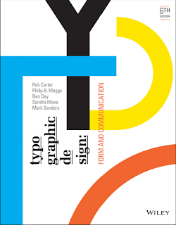
| Figure 1: Typographic Design: Form and Communication |
Reference:
The Anatomy of Typography
Page 31 - 47
 |
| Figure 2.1: Extending letterforms beyond cap height and baseline |
 |
| Figure 2.2: Different widths of horizontal and vertical strokes |
Values and tones of the font and background can influence the legibility of text. Sharper contrast is preferred as it improves readability. In colour, schemes like complementary colours can decrease legibility due to two different colours fighting for attention. It is advisable that the value of text and background also contrasts each other (e.g.: dark blue text, light orange background)
Programs like Adobe provided a chance for flexibility, allowing designers to resize text vertically/horizontally. This leads to the distortion of texts, which serves more of the purpose of expressing visual ideas rather than for reading. This should only be done after considering objectives, requirements, and limitations of the typographic problem at hand.


Comments
Post a Comment