Digital Matte Painting: Project 1 - Virtual Plein Air
01.05.23 - 19.05.23 (Week 5 - Week 7)
Chai Yi Xuan / 0346645 / B'
Creative Media
Digital Matte Painting / Entertainment Design
Project 1 / Virtual Plein Air
INSTRUCTIONS
To-Do List:
- Select 3 photography to paint without colour picking
Week 5
I decided to save time on looking for new photos and just picked three from the value studies I did for exercises. Then, I did a rough colour blockout of each painting. I had to resist the urge to colour pick the photos since it wasn't allowed, but I managed to pick a value closest to the photos (to the best of my abilities, anyway).
 |
| Figure 1.1: Selected photos picked from value study exercise |
 |
| Figure 1.2: Colour blockout #1 |
 |
| Figure 1.3: Colour blockout #2 |
 |
| Figure 1.4: Colour blockout #3 |
Week 6
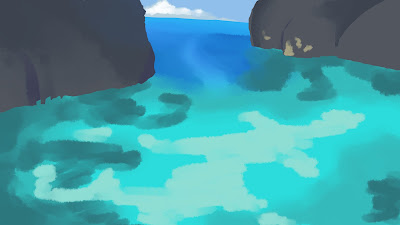
I proceeded to refine the colour blockout with shadows and lights. I decided to pick the sea painting to further refine and finalise, since I like the colour and want to try painting it.
 |
| Figure 1.5: Painting progression #1 |
 |
| Figure 1.6: Painting progression #2 |
 |
| Figure 1.7: Painting progression #3 |
At first it seems easy, since I thought I only needed to blend colour of the ocean. But as I progressed I realised that the colours and shades don't entirely match up the photo. I spent a lot of time trying to get it right, but it didn't go the way I wanted to. I also realised the same problem with the rocks and trees.
 |
| Figure 1.8: Refining stage |
Week 7
I felt like the problem was due to the texture of the rock, trees and sea. Therefore, I spent a few hours trying to get the texture (or at least, the shape of it) right. It still doesn't look a 100% accurate, but I felt like it was better than what I did before.
 |
| Figure 1.9: Finalising painting |
PDF presentation file for Project 1
FEEDBACK
Week 6
Good progression, but quickly choose one and refine it.
REFLECTIONS
The assignment, in reality, is probably one of the easier ones amongst the others I have for the semester. The real reason I struggled during this project was mostly because I couldn't colour pick from the photo, which I'm very used to when I have to refer to an existing colour palette. I spent a lot of time picking the colours until I get it right, and having to replicate the photo was another challenge entirely. I also struggled with the textures, which in the end I just tried to draw it over on top of a different layer.
I'd like to think that my sense of colours are decent enough, but having to do this assignment did help me see that shadows are not entirely black and highlights are not just saturated colours. To summarise it, it helped me expand my knowledge on colours and shades, which would help me a lot in the future if I needed to pick colours and paint for anything.


Comments
Post a Comment