Information Design: FLIP Exercises
11.01.22 - 04.02.22 (Week 2 - Week 5)
Chai Yi Xuan / 0346645 / B'
Creative Media
Information Design
FLIP Exercises / FLIP 1 & FLIP 4
LECTURES
Week 2 (L.A.T.C.H)
L.A.T.C.H
is a method of information organization that consists of 5 principles.
It is widely used when it comes to sorting information, and can be
easily seen anywhere (i.e.: in a supermarket, where food types are
categorized). L.A.T.C.H stands for:
- L - Location
- A - Alphabetical
- T - Time
- C - Category
- H - Heirarchy
Week 3 (Miller's Law)
Miller's Law, chunking, is a term referring to the process of grouping individual tasks into larger units. George Miller, a psychologist, conducted a research in 1956 in which he found the limit of the human ability to process information. In that research, he found that most people remember up to 7 items and 2 in their short-term memory.
To
improve the amount information remembered, chunking is used to group
information as a large whole, which will be make data more memorable.
Chunking
can be done by linking items that are similar to each other.
Information is first broken down into manageable bits. Then, by
identifying the similarity, the information can be grouped as a whole—
allowing us to remember things easily.
Week 4 (Manuel Lima's 9 Directive Manifesto)
Information visualization is a process that transforms abstract data into visual representations of semantics that attempt to communicate complex ideas clearly, while allowing the user to query the data in real time. Manuel Lima had written 9 directives clarifying what information visualization is about, and how it differs from information arts or infographics.
The 9 Directives:
- Form Follows Function
- Interactivity is Key
- Cite Your Sources
- The Power of Narrative
- Do Not Glorify Aesthetics
- Look for Relevancy
- Embrace Time
- Aspire for Knowledge
- Avoid Gratuitous Visualizations
Week 5 (Misinformation Crisis)
Misinformation
refers to false information that is spread regardless of intents; and
disinformation refers to false information that is spread with the
intent of misleading others.
Misinformation
(or disinformation) can lead to devastating consequences. For example,
in America, the information about the severity of Covid-19 was
falsified, and it led into 585 000 deaths.
It is important that as designers, we have to fact-check the information we are given to avoid the spread of fake news.
INSTRUCTIONS
To-Do List:
- FLIP 1 - Look up on the type of infographics (Group) and redesign an bad infographic (Individual)
- FLIP 4 - Search up on Manuel Lima's 9 Directive Manifesto and record the presentation (Group)
FLIP 1
Group Task: Types of infographic
Presentation video:
Figure 1.1: FLIP 1 presentation Group 8
Individual Task: Redesign a bad infographic
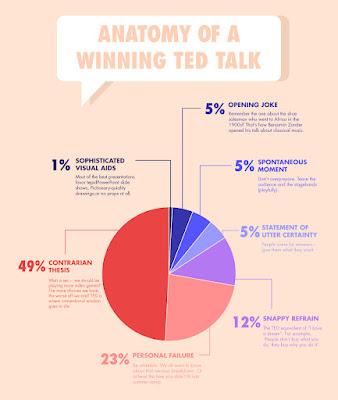
I searched up on bad infographics and found a few results. There were mostly used as an example of a bad design, and I decided to choose this infographic.
 |
| Figure 2.1: Infographic chosen to be redesigned |
Aside from typography hierarchy issues, the pie chart is extended and displayed on a top view. I deduced that maybe the designer wanted to try on something new, but the it ended up making the pie chart unreadable— and viewers have to refer to the text for context. The infographic is an Anatomy of a Bad Infographic.
I redesigned the infographic, taking into account of the information and the pie chart to make it more understandable.
Final Outcome
 |
| Figure 2.2: Redesigned infographic |
FLIP 4
Group Task: Manuel Lima's 9 Directive Manifesto
Presentation video:
Figure 3.1: FLIP 4 presentation Group 8
REFLECTIONS


Comments
Post a Comment